COMIC DETAILS
|
Comic Description:
|
Nowhere Men 3
|
|
Grade:
|
9.8
|
|
Page Quality:
|
WHITE
|
|
Certification #:
|
1150234013
|
|
Owner:
|
Still Only 35c
|
SET DETAILS
Owner's Description
Signed by Nate Bellegarde & Eric Stephenson on 3rd March 2013 at Emerald City Comic Convention, Seattle.
Purchased via ebay. Now residing in Melbourne, Australia.
From tumblr post by Nate Bellegarde
A bit about reprint covers.
I don’t think anyone working on Nowhere Men thought it would take off as well as it did. While we were all hard at work with forthcoming issues it became urgently necessary to put together covers to distinguish each printing. This was a very good problem to have. Because we couldn’t spare the time, we mostly ended up with modified versions of the first printing artwork.
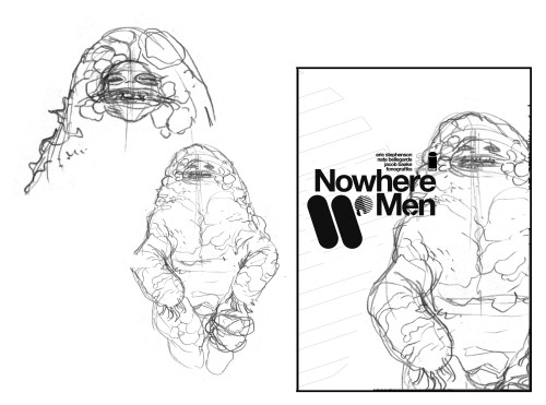
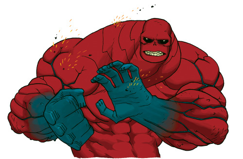
BUT if I had my druthers, in my perfect world were everything about the book was perfect, I would have made new artwork for each printing. Granted, all of the ideas I had for things I wanted to do involved creating SO MUCH work for myself. Which… I dunno, for some reason nobody thought that was such a super great idea, I can’t even imagine why. But I mean, why did I want to make more work for myself? I mentioned before about using the whole buffalo, and I really wanted the covers to function more than just the outside of the book, I wanted them to show an important but unseen aspect of the story inside. The cover for Nowhere Men #3 depicts Dr. Kurt McManus’ arm partway through his metamorphosis, and the back has his empty and uneaten cocoon, both things we were unable to actually see within the pages. So, I didn’t have the worst motivations for inventing new work for myself. Right? And by creating new art for the reprint covers, but more importantly creating new story information, I wasn’t trying to make a situation where readers HAD to snatch up every reprint to get their 100% out of the series, which is what might have happened. We would have had a whole Animatrix thing on our hands, but my hope was that by virtue of being something they could see online or at the store they would just be extra little bonus nuggets of content goodness.
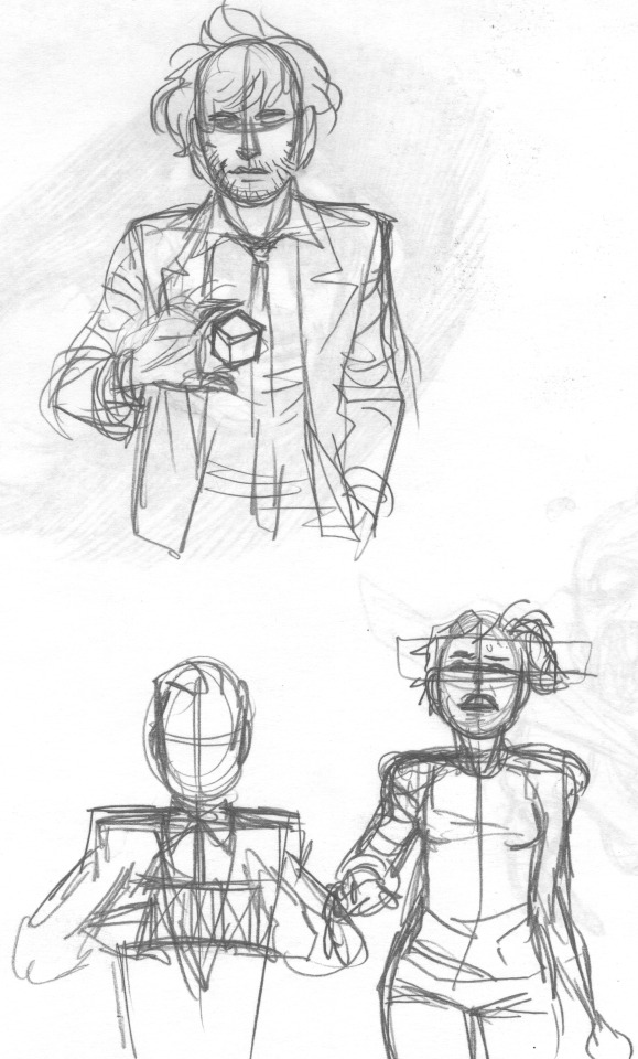
So here are a few design ideas I pitched as reprint covers when all this hullabaloo arose. There’s one with Dr. Karen Reynolds, which would be for Nowhere Men #2, I think she is naked and would have been covered in blood, everyone likes that sort of thing, right? What kind of little extra thing about her character are we getting into there, huh? The second image is Dr. McManus, what would have been a reprint for Nowhere Men #3, shown earlier in his metamorphosis but sometime after he was left for dead. Just looking sick-makingly disgusting, so nasty that your mind couldn’t help but insert an imagined smell. The next one is Dr. Thomas Walker (I haven’t double checked or anything but there are hell of PhDs all up in the book so I feel safe assuming all the characters have one) kinda levitating a cube. It resembles the Cubiq but since this would have been for reprints of Nowhere Men #4 it mirrors the flashback scene where he’s regarding a sugar cube. “I wonder if there is some deeper significance to cubes?” is what this cover would have seemed to demand. Then there are two proposed designs for Nowhere Men #5, though neither of them do anything significant to advance readers’ understanding of the plot. One is Dr. Simon Grimshaw holding up a cat’s cradle in his hands where the string forms the shape of a DNA double helix. Get it cause he’s the genetic engineering guy do you get it! We ended up doing a similar image for the cover proper but I’m a little sad we didn’t use this image because I thought it was neat. Like I would have tried to get it used as a photo for a magazine article about cloning or something. Anyway, the second one is Dr. Adra Madan, doing something no doubt related to the skirmish she has with Dr. Benito the Science Punk in the issue. She is just kinda standing there, so I think I wanted to have it look, like, a THOUSAND times more glitchy than her appearance on the cover to Nowhere Men #4. I know I really wanted to do something where it looked like the cover was misprinted, like there was an actual in-real-life-IRL screw up at the printers when the book was being done, so maybe it was that. Again, its not really a planet-shattering revelation, it just reinforces her ability to make stuff “not work.”
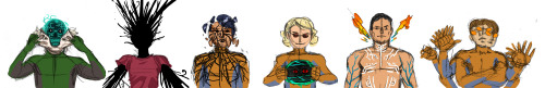
I believe the row of characters were a pitch for issues 7-12, but this was mostly blue-sky thinking back when we were in the middle of my run, we definitely would have gone someplace else with those covers by the time we go to them. The idea here was to highlight each of the survivor characters with an abstract or metaphorical representation of their new abilities. I hope no one is startled to see these characters wearing jumpsuits, especially if you have seen the cover to the trade paperback for Volume 1. Unless, of course, you consider it a spoiler to know that the jumpsuits indeed zipped all the way up. I really liked the heck out of these sketches, I don’t know what they COULD have been used for, cause dang, but oh well.
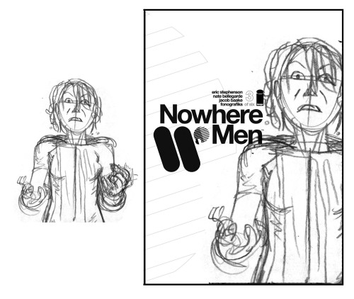
Lastly, after a certain point, reprint covers were handled by Dr. Eric Stephenson and Dr. Fonografiks because I needed to be left to focus on drawing pages. They would pick some art from inside the book and repurpose it to work with the cover, as was the case with the characters’ ID card photos and magazine cover withe Dr. Emerson Strange, tweaking the colors or applying a new effect. For a reprint of Nowhere Men #3, they used a new bit of art that wasn’t from the interiors but also wasn’t drawn for a cover. It was originally a finished design drawing of Dr. McManus from when work first began on the book, “concept art” or whatever for how his arms would be colored. In a small, dark place deep inside, a part of me was bothered by this because I would never consider that artwork to be “cover quality.” I consider it to be “cool” or heck if pressed, even “rad,” but on paper the original artwork is maybe 2 inches by 3 inches, and the coloring was only meant to serve as an example. When it was all blown up, the lineart becomes thick and chunky and doesn’t fit in with the rest of the book. Obviously, no one would ever notice this or care, and it isn’t even an actual problem, but it did cause me to start withholding finished character illustrations in order to prevent them from being likewise repurposed. I’m not bent out of shape or upset about the incident at all, it’s just a thing that happened. Not really a fun fact… more like a weird fact? Like I just started hoarding my own drawings? It would be a weird note to end on.
|
|
|